Line Graphs
Line Graph: a graph that shows information connected in some way (usually as it changes over time).
You record the temperature outside your house and get these results:
| Table: Temperature 22 Feb |
|||
| 8:00 | 10:00 | 12:00 | 14:00 |
|---|---|---|---|
| 24° | 32° | 36° | 29° |
You are interested to see how it rises and falls, so decide to make a line graph:
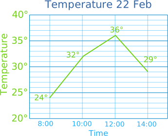
It makes the data come alive, right?
You can see how much it cooled down after lunch.
When should we use a line graph?
Line graphs are best when the data has continuous change (like temperature or height). Connecting the dots makes sense!
If the data is in separate categories (like colors or types of pets), a Bar Graph is a better choice.
Making Line Graphs
You can create graphs like that using the Data Graphs (Bar, Line and Pie) page.
Or you can draw it yourself!
Example: Ice Cream Sales
| Table: Ice Cream Sales | ||||||
| Mon | Tue | Wed | Thu | Fri | Sat | Sun |
|---|---|---|---|---|---|---|
| $410 | $440 | $550 | $420 | $610 | $790 | $770 |
Let's make the vertical scale go from $0 to $800, with check mark marks every $200
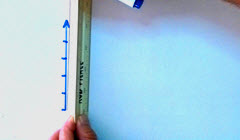
Draw a vertical scale with check mark marks
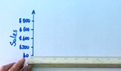
Label the check mark marks, and give the scale a label
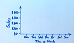
Draw a horizontal scale with check mark marks and labels
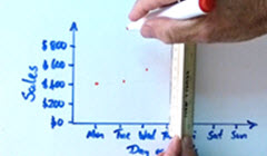
Put a dot for each data value
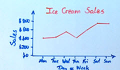
Connect the dots and give the graph a title
Important! Make sure to have:
- A title
- Vertical scale with check mark marks and labels
- Horizontal scale with check mark marks and labels
- Data points connected by lines